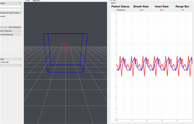
Tool/software:
Hello,
Using the previous version of the radar toolbox to run the vital signs demo, I was able to get a plot of displacement vs time. But in the latest version, radar_toolbox_2_20_00_05, the visualizer only provides a graph with no axis named and sign plots in red and blue color. I got quite confused about the elements on the plot and got the following questions -
1. What is the y axis? The blue and red signs in the plot do not seem to match the real amplitude of displacement. (As you can see the blue one representing breath waveform has even lower amplitude than the blue one which is the heart rate waveform. This is obviously impossible practically if y axis represents the displacement).

2. I see that the plot changes rapidly by time, so I wonder what is the unit of x axis? Seeing from the data recorded in the visualizer, taking the breath waveform unit as an example, these 15 values recorded in the unit must represent the scatter points in the graph to form the breath signs. Are these values corresponding to the frequency of breath changing by time? I also observed in the recorded data, there are 16 frames difference between the previous waveform unit and the consecutive next waveform unit, so is plot renewed for every 16 frames?
"breathWaveform": [
0.12593555450439453,
0.07852530479431152,
0.08716845512390137,
0.09793853759765625,
0.11945652961730957,
0.20462584495544434,
0.4221564531326294,
0.6239681243896484,
0.6360690593719482,
0.4900805950164795,
0.36772727966308594,
0.3098773956298828,
0.2714111804962158,
0.24837470054626465,
0.24168610572814941
]
3. If the waveform unit records the frequency, how can I convert it to a plot showing displacement (mm) vs time (ms)?
Thank you !


