This thread has been locked.

If you have a related question, please click the "Ask a related question" button in the top right corner. The newly created question will be automatically linked to this question.

AWR1843BOOST: Micro-doppler plot Interpretation?

Part Number: AWR1843BOOST
Other Parts Discussed in Thread: DCA1000EVM

I am using the AWR1843BOOST with the DCA1000EVM to collect raw radar data.  In these screenshots, the data was collected for 400 frames using a MIMO TDM chirp configuration with 3TX and 4RX.  I used the following chirp configuration and got the following Post Proc results:

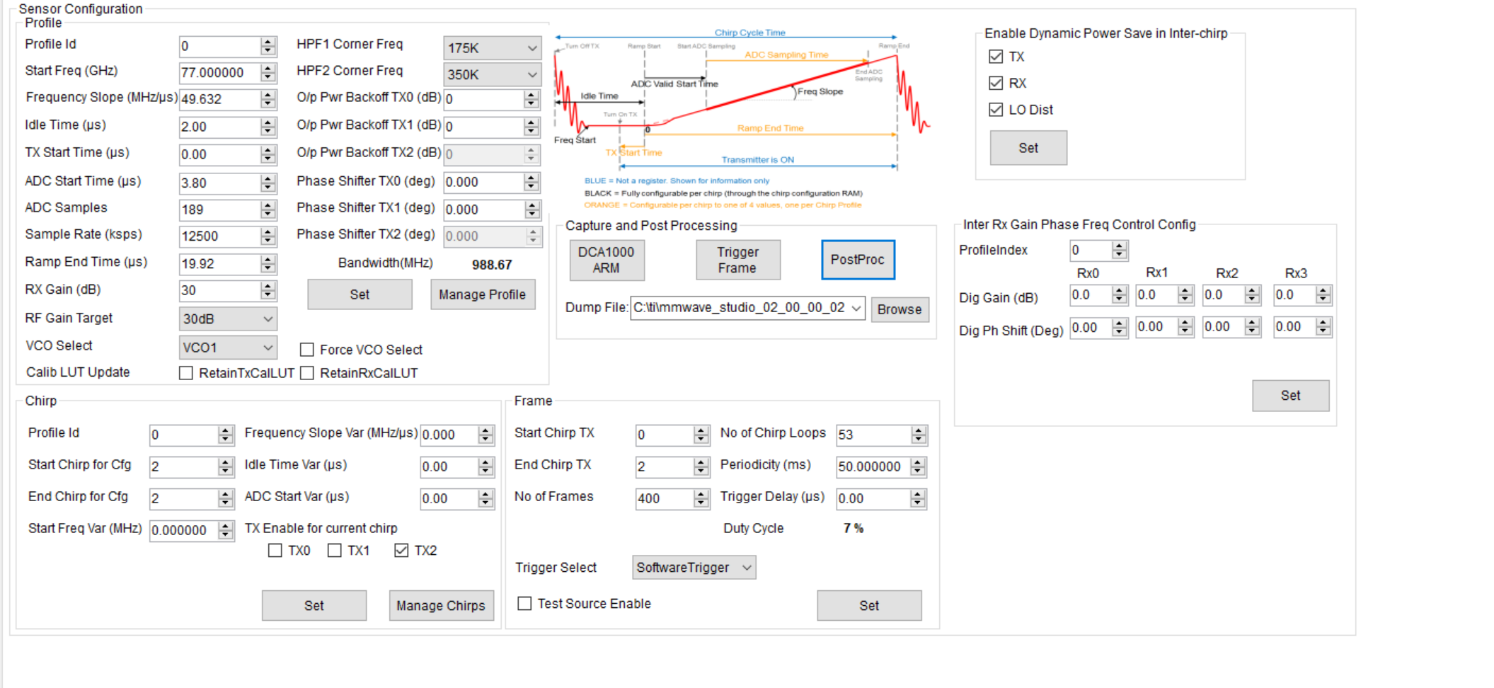
The post proc output has a microdoppler output.  Upon clicking on the microdoppler menu, I was prompted to put in the microdoppler regions I was interested in, which as shown in the range-doppler map, is ~3.7 meters for my moving target.

After clicking OK, the PostProc generated the following microdoppler plots:

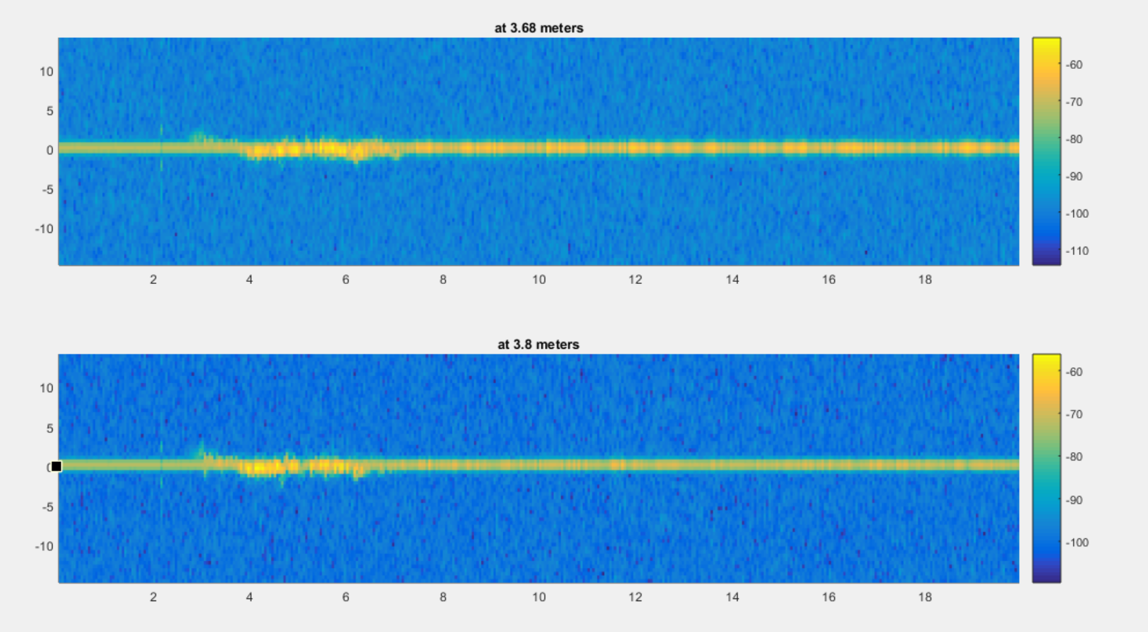
How should I interpret these plots?   What do the X and Y axes mean and what are their units? Is there documentation I can read somewhere on how to use the microdoppler feature?

  • Hi,

    We have to check with mmwave studio team and get back to you.

    thank you

    Cesar

  • Samantha,

    Here are a few answers to the questions you were asking:

    What is the proper interpretation of these plots?

    • Each column of the plot represents a range gate (i.e. all Doppler bins at a specified range) for a specific frame.

    What is the correct label and units for the X axis?

    • The x-axis is frame number.

    What is the correct label and units for the Y axis?

    • The y-axis is Doppler (m/s)

    What are the units for the output colors?

    • The output is 10*log(FFTOutput). It is in the standard MATLAB color-scheme for mesh plots – brighter (i.e. yellow) represents higher powers, darker (i.e. blue) represents lower powers.

    Regards,
    Kyle

  • Hi Kyle,

    Thank you for your prompt response; I now understand how to interpret the plots.  Is there a way to adjust the x-axis to see all of the frames/a different range of frames on the microdoppler plot, or can I only see the first 20 frames with this feature?

    Thank you,

    Samantha

  • Samantha,

    To add on to my previous post, the x-axis is actually showing all of the captured frames. So in you particular case, you are capturing 400 frames of data where the periodicity of each frame is 50 ms. This means that the total capture time window is 20 seconds. This matches what you see in the microdoppler plots.Each column of doppler values corresponds to one frame.

    So now what you are actually seeing the doppler output for each frame over the 20 second capture window at a specific range bin/position.

    You can use the MATLAB zoom features to zoom in to see a subset of frames. You can also use the 3D rotate feature to see the intensity values in three dimensions.

    Regards,

    Kyle

  • Thank you Kyle, that answered my question perfectly.