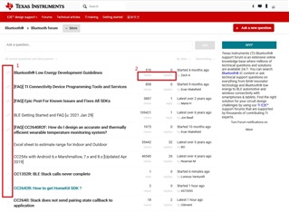
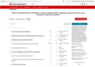
I see there are huge changes on TIE2E forum UI and would like to suggest the following two points.
1. The discussion and question buttons are grey and not easy to read. Is it possible to use a more bright icon?
2. I think it's better to put views and replies on top to those two columns as "By date"