This thread has been locked.

If you have a related question, please click the "Ask a related question" button in the top right corner. The newly created question will be automatically linked to this question.

WEBENCH-POWER-DESIGNER: Bode plot diagram presentations needs improvement

Part Number: WEBENCH-POWER-DESIGNER

Team,

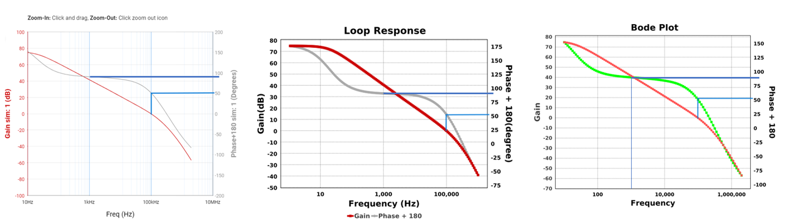
I just closed a 4 email investigation to prove to my customer that the three diagrams below show the same data, which is not obvious due to change of axis and lack of granularity.

I see that this was a topic before as well -  WEBENCH® Tools: Range and resolution in Bode plots

Diagram one comes from Webench online-tool, and two+three from the generated Report:

Improvements to consider:

1) In first diagram, the major lines should be one per decade, else the minor-lines become faulty. Here we see that the first minor-line is not placed in the middle where the "10kHz" label would reside.

2) The diagram two and three has individually different axis ranges from both other diagrams (same bode plot !), which change the appearance of the curves, and confusing customers. This is bad. Use same range for all.

3) Granularity of the Phase-side Y-axis to readout phase values could be improved. I propose a scale on the axis itself with major-lines for the Phase axis values, and one minor-line between them.

Thanks for listening.

B.r Magnus Aman

  • Hi ,

    We are able to replicate this issue. 

    We will check previously discussed topics and what was concluded. 

    We have taken this issue, we will update you soon on our findings.

    Appreciate your patient support. 

    Thank you

    Best Regards, 
    Sateesh A G

  • Hi Magnus Aman,

    Thanks for above post, Below are our comments on above suggestion:

    1. We are checking this with the software team and we will get back to you on this once we have an update from the team,  This is added to our task pipeline.
    2. Sure, Going forward we will use same range for the bode diagrams
    3. Could you please clarify on this comment, Are you referring to results from simulate option or all the charts, if you can share an image, it will be easy for us to understand

    Regards

    Shaheen

  • Shaheen,

    Sure. For #3 here is a logarithmic reference scale where I superimposed Webench's scale from the online tool diagram, that has minor scale lines too.
    We clearly see that the minor lines do not fit any system. If you consider one decade 1-10 then the real minor line to value 2 is way more to the left. If you consider two decades 1-100, then the minor line for in-between value10 must me exactly in the middle.

    Did this clarify?

    B.r Magnus

  • Hi Magnus,

    Thanks for sharing the details, We will share this with team and get back to you once we can update.

    Regards

    Shaheen

  • Shaheen,

    I think that I accidentally answered #1. Here is my proposal for #3:

    /M

  • Hi Magnus,

    Thanks for sharing the details for #3, We will check this with team and get back to you.

    Regards

    Shaheen

  • Hi Magnus Aman,

    Thanks for suggesting all the improvement points. This will definitely help us to improve Webench charts. We have already forwarded this request to the software team and its added in their pipeline. Since this will be planed based on the criticality and available bandwidth, it might take a long time. For now we are closing this thread.

    Thanks and Regards,
    Umayal