This thread has been locked.

If you have a related question, please click the "Ask a related question" button in the top right corner. The newly created question will be automatically linked to this question.

WEBENCH® Tools: Range and resolution in Bode plots

Tool/software: WEBENCH® Design Tools

The Bode plots available in the Simulate option in the HTML version of WEBENCH have some limitations not seen in the Flash tool. (The screenshots below are taken from my design https://webench.ti.com/appinfo/webench/scripts/SDP.cgi?ID=3C4DF41EE361E473 .)

1. It's not at all obvious how to change the range of the frequency axis. I went back to the Flash tool and it says there "Zoom-in: Click and drag downwards; Zoom-out: Click and drag upward". It turns out this works in the HTML tool as well, but it really ought to make that clear.

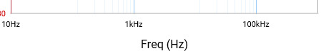
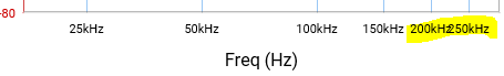
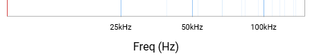
2. The Frequency axis in the Flash tool has a conventional logarithmic grid with 9 steps per decade (so there's a grid line for 1kHz, 2kHz, 3kHz etc. up to 10kHz then 20kHz etc.), but the HTML tool spreads that number of steps over two decades so the grid lines are at odd frequencies. If you zoom in the frequency axis you see a regular logarithmic grid overlaid on a fainter, highly irregular grid:

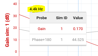
3. The Marker (cursor) in the Flash tool displays frequency, gain and phase with plenty of significant digits (actually too many), and if you zoom in the frequency axis you can position the Marker quite accurately to read out features of interest such as crossover frequency and phase margin:

The HTML tool is more limited in a couple of ways:

(a) The displayed resolution in frequency is much coarser (2 significant digits), and does not improve if you zoom in the frequency axis, although the resolution in gain and phase is still more than adequate (3 decimal places).

(b) If you zoom in the frequency axis to allow finer control of the Marker, you can find different values of frequency (even with its coarse resolution) that report identical values of gain and phase (even with their fine resolution), which looks like a bug:

  • Thank you Richard for the great feedback. We will add this to our backlog and plan it for the upcoming releases. Please continue to provide us with your valuable feedback. Your feedback is important to us. I will get back to you on the timelines when these improvements will be on production shortly. 

    Thank you 

    Raj

  • Raj,

    I notice that almost all of the issues I raised above have been fixed, which is great - thanks. The small issue with the default (fully zoomed out) horizontal grid has not been addressed, so perhaps I should explain this more carefully in case my original post has been misunderstood. In the default view the horizontal axis looks like this:

    There are 8 minor (faint) grid lines between each major (bold) grid line, so if the major grid lines had been just one decade apart (e.g. 1kHz and 10kHz) the minor grid lines would have made sense (in that case being at 2kHz, 3kHz, 4kHz, 5kHz, 6kHz, 7kHz, 8kHz and 9kHz). However the major grid lines are actually two decades apart (e.g. successive ones are at 1kHz and 100kHz), so the minor grid lines are at really strange frequencies, which I estimate using the marker (cursor) as roughly 12kHz, 23kHz, 34kHz, 46kHz, 57kHz, 67kHz, 78kHz and 89kHz.

    The zoomed-in view has been improved since my original post by removing the minor grid lines, which were at highly irregular frequencies. An issue does however remain at certain zoom levels which cause the axis labels to collide:

    Regards,

    Richard

  • Thanks Richard for the feedback, I will add the feedback to our backlog and discuss it with the team. 

    Thanks 

    Raj