This thread has been locked.

If you have a related question, please click the "Ask a related question" button in the top right corner. The newly created question will be automatically linked to this question.

TDA4VH-Q1: How to Interpret AWB Tuning Output Graphs

Part Number: TDA4VH-Q1

Tool/software:

Hi,

I am trying to understand the results of the output of AWB tuning done using the DCC tool and have 2 questions about the gray level graphs and the "Measured and interpolated reference for all gray levels". I am using VPAC3 for J784S4.

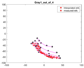
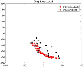
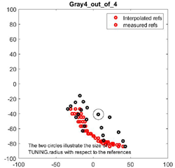
Questions 1: I posted the graphs for all 4 gray levels below. In each graph I see 4 distinct lines highlighted by the pink line. What exactly are these 4 distinct lines representing?

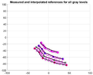
Question 2: The "Measured and interpolated reference for all gray levels" graph also has 4 distinct lines. What do each of those represent? What do the colors used (green, blue, red and pink) for each lines mean? Specifically is there a reason why green, blue, red and pink were chosen? 

Thank you for your help.

  • Hi Vaibhav,

    Your calibration does not look good.
    Please follow the AWB plugin guide carefully.
    Most likely, you have not set the black level correctly.

    What exactly are these 4 distinct lines representing?

    Those are for measured on 4 different gray patches of the color checker.

    What do the colors used (green, blue, red and pink) for each lines mean? Specifically is there a reason why green, blue, red and pink were chosen? 

    The color has no specific meaning in terms of AWB calibration.

  • Hi Gang. Thank you for the clarification.

    So just to be clear the lines in the gray level graphs 1 - 4 are lines for each gray patch right? If that is the case should each gray graph have only 1 line? Why does Gray1_out_of_4 have 4 lines?

    For the Measured and interpolated graph I am assuming based on the description each line is supposed to represent one of the gray levels right? This graph simply is meant to combine all gray 1 - 4 graph data right? 

  • Hi Vaibhav,

    So just to be clear the lines in the gray level graphs 1 - 4 are lines for each gray patch right? If that is the case should each gray graph have only 1 line? Why does Gray1_out_of_4 have 4 lines?

    I believe all of the 4 lines for main references are plotted together in these 4 graphs.
    Only additional references are plotted separately.

    For the Measured and interpolated graph I am assuming based on the description each line is supposed to represent one of the gray levels right? This graph simply is meant to combine all gray 1 - 4 graph data right? 

    Yes, it is for plotting all 4 lines together.