Part Number: TM4C1290NCPDT
Tool/software: Code Composer Studio
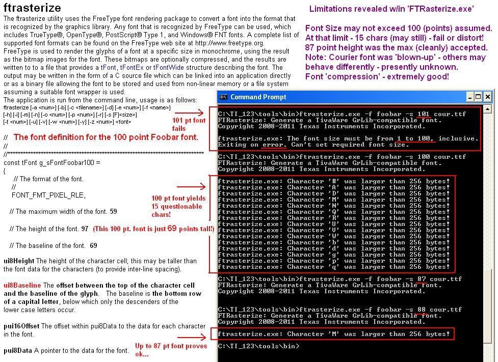
Hey i want to have bigger fonts more than 100 pt !!
How can i do the same?
Part Number: TM4C1290NCPDT
Tool/software: Code Composer Studio
Hey i want to have bigger fonts more than 100 pt !!
How can i do the same?